Hi friends,
It’s been a while! This month has been hectic, but I finally wrapped up two projects and took some time off for a family trip to Miami. In this post, I want to share my thoughts on the trip and reflect on it from a product designer’s perspective.
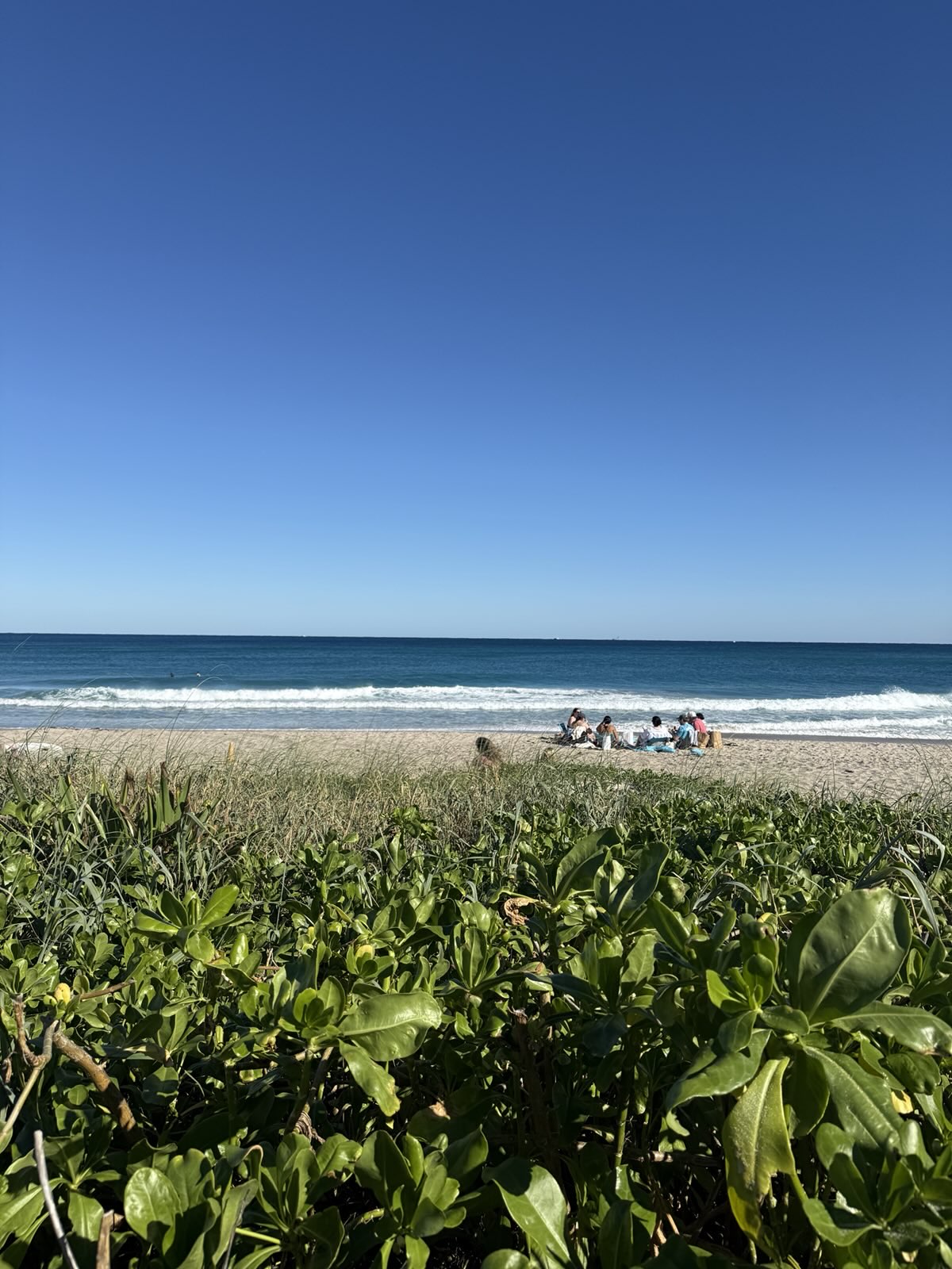
A week before Thanksgiving, we took our 11-month-old daughter on her first domestic trip within the U.S. It was both challenging and rewarding, with plenty of unexpected moments along the way. We stayed at a hotel near South Beach, and waking up to ocean views and sunrises was an absolute delight. On a friend’s recommendation, we also visited West Palm Beach, and I was blown away by its beauty—the deep blue sea, refreshing ocean breeze, and people relaxing on the beach made it hard to leave. The Breakers Hotel nearby was another highlight; stepping into its grand lobby felt like walking into a European palace. I hope to stay there someday!
Reflects From a Product Designer’s Perspective
What Worked (Several aspects of the trip impressed me as a designer)
- Flight Notifications: On the day of departure, my phone’s lock screen displayed a countdown to the flight, and swiping up moved the notification to the top bar for easy access. I had also checked in the night before and saved the tickets to Apple Wallet, making check-in and boarding a seamless experience.
- Clear Wayfinding: Upon landing at West Palm Beach Airport, clear signage guided us to the rental car shuttle, and we quickly found our way. Later, we realized the parking app we used in Miami was one we had previously downloaded for another city, which made it even easier.
- Well-Maintained Beaches: Both Miami’s South Beach and West Palm Beach had thoughtful signage at the entrances, highlighting lifeguard availability and safety tips. The beaches and pedestrian walkways were clean and well-maintained, showing great care in upkeep.
What Didn’t Work (Of course, there were also frustrating moments that highlighted areas for improvement)
- Amazon Play Mat Mishap: Before the trip, we ordered a play mat from Amazon to ensure our daughter would have a familiar sleeping environment. Unfortunately, the package we received at the hotel contained four photo frames instead of the mat. It’s still unclear whether this was due to a fraudulent listing or a warehouse error, but it left us scrambling.
- Flight Notification Chaos: While departure notifications were well-designed, the return trip was a different story. I received multiple emails and text messages about flight delays, but no lock screen notifications. Only after opening the app did I discover the flight had reverted to its original departure time. We missed the flight, and customer service was unhelpful, even hanging up on us. At the airport counter, we encountered other passengers with similar issues. The staff struggled with our infant ticket, repeatedly printed incorrect boarding passes, and failed to confirm baggage check-in. It wasn’t until we reached the gate that everything was finally sorted.
- Hotel Refund Issues: We prepaid for our hotel via Amex’s website, but at checkout, the hotel charged us again, resulting in double payment. While we were refunded the next day, $95 was still missing. The hotel provided no clear explanation, saying it was Amex’s issue, and asked us to resolve it through the credit card company. Compared to Amex’s refund tracking system, which shows a timeline and status updates, the hotel relied on phone calls, making it difficult to track progress.
Final thoughts
Traveling with a baby wasn’t exactly relaxing, but it was filled with memorable moments—like hearing my daughter laugh out loud, watching her nap peacefully on the plane, and soaking in the sunshine and beach. That said, the frustrations also stood out, from digital product issues to real-world service problems.
Here are some thoughts on how these experiences could be improved:
- Better Flight Notifications: Add prominent warnings when flight times change and encourage users to double-check in the app. Faster customer support options could also reduce stress in time-sensitive situations.
- Streamlined Ticketing at Counters: Airport systems should clearly display updates for flight changes, seat assignments, and baggage check-in to handle special cases (like lap infants) more efficiently.
- Integrated Hotel Systems: Hotels could offer a digital system that tracks the entire guest journey—from check-in to checkout—with clear payment records and refund updates to avoid confusion.
- Improved E-commerce Transparency: Platforms like Amazon could enhance quality control, like flagging potentially fraudulent listings.
This trip gave me some ideas for improving the interaction between digital and real-world experiences. Next time, I’ll share reflections from my trip to Kyoto and some product design insights!
Until next time,
Long
嗨讀者朋友,
好久不見!這個月終於忙到一個段落,完成了兩個案子後,我抽空帶家人去了邁阿密旅行幾天。這篇文章想和大家分享這次旅行的感想,還有從產品設計師角度延伸的想法。
在感恩節的前一週,我們帶著 11 個月大的女兒進行了一次美國國內旅行。這是我們第一次帶著嬰兒旅行,充滿挑戰但也有許多快樂的時刻。我們住在 South Beach 附近的飯店,能在房間裡直接欣賞海景和日出,真是非常幸福。朋友推薦我們到 West Palm Beach走走,一去不得了,完全不想離開,深藍的海、涼爽的海風、坐在沙灘上放鬆的人們,太美好了。而附近的 The Breakers Hotel 更是完全超乎我的期待,走進大廳彷彿進入了歐洲的皇宮,富麗堂皇的室內裝修與花卉,希望下次能有機會在那裡住一晚。
從產品設計師的角度看這趟旅行
良好的體驗
- 航班資訊便利:起飛當天,手機的鎖定畫面通知顯示距離起飛還有多久,解鎖後通知會自動移至螢幕上方,可直接點擊查看航班資訊。我提前一天 check-in 並將機票存入 Apple Wallet,入關和登機時點開Apple Wallet掃描,一氣呵成。
- 指示與標示清楚:到達 West Palm Beach 機場後,我們根據清楚的機場指示找到租車接駁車的搭車處,順利租車並開往邁阿密。在邁阿密路邊停車時,繳費使用的 App 剛好是我們之前在其他城市下載過的,非常方便。
- 海灘與公共設施維護良好:無論是 Miami South Beach 還是 West Palm Beach,海灘入口都有清楚的救生員和安全提示標示,海灘和人行道也都維護得非常乾淨。
不好的體驗
- 包裹出錯:我們從 Amazon 購買了一個適合寄送到飯店的地墊,讓女兒能在旅館有熟悉的睡眠環境。但拿到包裹後打開一看,竟然是四個相框,而不是地墊。不確定是商家詐騙還是倉庫寄錯,幸好最後女兒在床上睡。
- 航班通知混亂:回程時,我多次收到簡訊和 Email 通知說飛機延後起飛,直到登入 App 才發現航班改回了原本的起飛時間。我們因此錯過了航班,我透過App找到客服電話,撥打過去後客服非常不積極,還處理到一半掛斷電話。到機場櫃檯改票時,也遇到其他同樣因通知錯誤而趕不上的旅客。櫃檯人員處理我們的嬰兒票時因系統不順,多次印錯機票,行李托運也漏掉,需要到登機門才能劃位,整個過程非常混亂。
- 飯店退款問題:我們透過 Amex 網站預付飯店費用,但退房時飯店再次收取全部費用,導致重複扣款。雖然隔天退了部分款項,但差了 $95 元。飯店只說少收的部分是信用卡問題,讓我們自己去找 Amex 處理。相比信用卡的退款申請流程有時間軸和狀態顯示,飯店全程僅用電話通知,進度非常難掌握。
感想與延伸發想
有嬰兒的旅行好像沒辦法放鬆,不過也充滿溫馨時刻,女兒開心大笑大叫的時候、在飛機上睡得安穩的時候,以及海灘上放鬆的氛圍。也有疲憊加倍的時候,尤其是上述那些不太好的體驗。
從產品設計師的角度,我想到一些可以改善的地方:
- 航班通知改進:當航班時間變更時,應加註明顯的警語提醒使用者登入 App 確認起飛時間,並提供快速客服功能以應對緊急情況。
- 櫃檯操作透明化:在改票時,櫃檯系統應清楚顯示機位、行李托運與改票細節,減少因特殊情況(如嬰兒票)導致的混亂。
- 飯店系統整合:建立更清楚的數位化系統,從入住到退房、費用明細到退款流程,讓住客能隨時掌握付款與扣款狀態。
- 線上購物保障:增加商家資訊的透明度,避免虛假商品資訊,提供申述系統或是一些緊急應變措施。
以上是這趟旅行的反思,也給了我不少設計靈感。下次再來分享我今年的京都旅行與更多設計師的延伸想法吧!
下次見啦,
Long


